
Secret No1: Knowing when and how to KISS
In our first issue of The Seven Secrets Of Packaging Excellence, Matt Michaud PRS IN VIVO’s Chief Creative Officer picks the brains of 3 of the top global branding and design agencies to find out more about the fine art of KISSing.
As a packaging researcher, I’ve often found myself in the middle of a design tug of war between brand managers looking to maximize their front of pack real estate and branding agencies extolling the virtues of minimalist design as they rhythmically bang their creative fists on the table to the entrancing chant Less Is More!
The widely celebrated adage Keep It Simple Stupid (with its saucy acronym, KISS) is said to have been coined by the late Kelly Johnson, a leading aeronautical engineer instrumental in the design of the legendary Lockheed Blackbird spy plane.
His catchy one-liner soon became something of a mantra and guiding design principle across the company. The motivation behind it was unsurprisingly… pretty simple: whatever the engineering team at Lockheed created, it had to be simple enough to be repaired quickly by someone with only rudimentary mechanical training and a basic toolbox.
And then there’s ever-quotable Einstein who said “If you can’t explain it simply, you don’t understand it well enough.”
There is undeniable wisdom in the words of both Johnson and Einstein, but how can they be applied to packaging design and winning at retail?
To really understand the power of simplicity in packaging design, you need to start by understanding real behavior.
Human beings are exposed to stimulus, en masse, every second of the day. To navigate our way through this cognitive overload called ‘Life’ our brains develop a series of mental shortcuts, aka heuristics. Think of them as personal coping mechanisms for making sense of what surrounds us so we can make decisions and take action, faster. The problem is that stimulus is constantly in a state of accelerated growth, meaning that the time we have to process it is getting shorter and shorter.
Literally, in the blink of an eye, we need to be adept at distinguishing between right and wrong, helpful and unhelpful, cautious and risky, healthy and unhealthy. The list goes on…To put that into shopping terms, the average selection time for an FMCG product is 2.2 seconds driven by a combination of System 1 and System 2 thought processing. However, the average de-selection time is a mere 0.34 seconds driven solely by System 1 thinking.
This is important data as it clearly illustrates that before shoppers ‘select’ a product, they ‘de-select’ a whole host of others, first. In turn, begging the question as to why brand managers and designers continue to target the precious 2+ seconds of shoppers’ time to make an impression, rather than the sub half-second they have to avoid de-selection.
This is why design simplicity is paramount. One of the key drivers of de-selection at FMOT (First Moment Of Truth) is shopper alienation. This is predominantly because the story or message being conveyed in 0.3 seconds is unclear, unremarkable, or both.
Jon Davies - Co-Founder at Butterfly Cannon based in London, UK,– draws a crucial distinction here between simplicity of design and message.
‘A pet hate of mine is when simplicity is defined as minimalism. Ultimately, we’re in the business of communication, trying to make sure our brand message is easy and simple to get. To do this we often have to layer in clues, signs and signifiers that tell our story -stuff that quickly evokes powerful associations in our consumers’ heads. In some cases, this may mean clean architectural lines, open sans-serif typography and lots of expansive space but if a brand’s spirit lies in the Italian Renaissance, then you’re going to need a ton of design complexity to convey that message simply.’
The storytelling dimension here is particularly pertinent. We’ve all come to learn that humans are much more likely to remember a story than isolated facts or figures. Yet, agencies are still being provided with creative briefs/guidelines that revolve around the number of pack elements and their corresponding pecking order within the messaging hierarchy.
Richard Stayte Global ECD at Elmwood in Singapore incisively refers to the importance of focused expressiveness vs. reductive design exercises.
‘I get the fact that on each pack there are ‘must haves’ but the real creative challenge for me lies in singularity rather than hierarchy. As designers, our most important question is ‘What’s the one thing you want your packaging to communicate?’
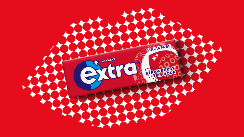
The recent Extra re-brand by Elmwood bridges the tension between iconicity and flexibility. The circular brand shield provides both focus on shelf and the inspiration to unlock rich brand expressions beyond pack.
For Kate Wadia – Co-Founder and CCO at Mrs&Mr, New York US - it’s imperative to highlight the difference between ‘simple’ merely as a design aesthetic and ‘simple’ as a powerful means to connect with humans on a raw emotional level.
‘Simple is not a trend. It’s a design principle that’s timeless. And what makes it so powerful is its ability to communicate quickly and emotionally. You’re not reading what’s in the starburst unless you’re drawn to it in the first place!’
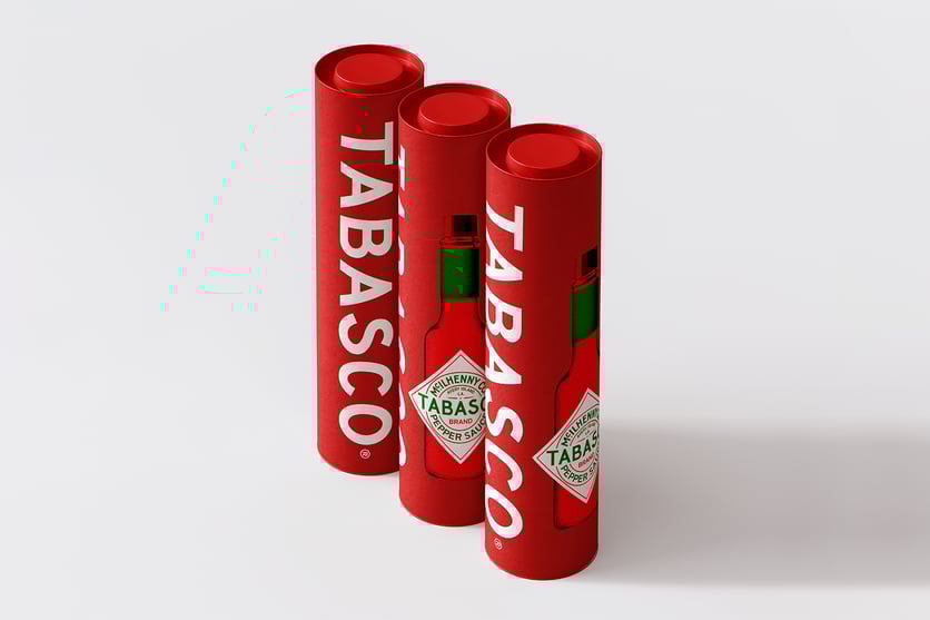
With the nascent re-design of this global spicy icon by Mrs&Mr, balancing heritage with contemporary relevance was key to achieving simplicity in design for Tabasco. The team focused just as much on what to evolve, as the design elements to cherish and protect.
However, like everything in life, the notion of design simplicity is relative and can flex across different cultures and contexts. Teru Yamabuchi Creative Director at Elmwood in Shanghai draws attention to the importance, as a designer, of empathising with your end-user and taking the time to really understand the shopper experience at the all-important FMOT.
‘You need to think about the context in which shoppers are interacting with your products and what their typical behaviour is. Looking at Asia for example, we know that your average shopper in India will engage with a product for slightly longer than say other Asian markets like China. That gives us a little more creative latitude to include more design elements if we feel they will be helpful in driving purchase.’
But even when you’re fully versed in both the emotional and functional power of design simplicity it’s not always easy to know when to KISS or how far you want to go… light peck on the cheek, juicy lip-smacker or full-blown French..?
In our experience at PRS IN VIVO, design simplification needs to be considered carefully - particularly at packaging design re-stages where especially large, established brands stand to lose more than they do to gain. Brand managers are all too aware of the hard-earned visual equity they’ve built over the years through the continued use of their distinctive brand assets and are understandably cautious when it comes to entertaining more revolutionary pack changes.
Branding agencies, on the other hand, can demonstrate real added value in creatively challenging the status quo and pushing the design boundaries, provided the sacred cows are retained or even hero-ed.
The truth is that while there are numerous cases where overcomplicated pack designs have confused prospective buyers at shelf and ultimately brought about a decline in sales, there are equally a good number of examples of over-simplification where the brand has ‘thrown the baby out with the bathwater’ and alienated existing shoppers.
Our view is that simplicity in the delivery of your key message is critical when it comes to packaging design. Whether that is achieved via simple or complex design approaches is something we’ll leave to designers 😊
Psst… this is just the first of our Seven Secrets Of Packaging Excellence.
We don’t give it all up on the first date. Sorry, we’re just not that kind of agency...
But if you are up for a second date you know where to find us!
For now we will sign off with a simple KISS. Short n’ Sweet!
Special thanks to:
Kate Wadia Co-Founder/CCO at Branding & Strategy agency Mrs&Mr, New York – US Richard Stayte Global ECD at Elmwood Singapore
Teru Yamabuchi Creative Director at Elmwood in Shanghai – CN
Jon Davies – Co-Founder and Creative Director at Butterfly Cannon, London – UK Richard Bell – MD PRS IN VIVO, US
Olivier Blanchet – CEO PRS IN VIVO
About the Author:
Matt Michaud is Chief Creative Officer at PRSIV and has worked in the wild and wonderful world of consumer insight, brand design and product innovation for the best part of 20 years analysing over a thousand pack designs. In that time, it’s fair to say he’s seen his fair share of packaging successes and failures!
ABOUT PRS IN VIVO
PRS IN VIVO, a leader in behavioral research and readily recognized as the world leader in package testing, runs market research in both online and in-person environments.